Outputs
After your analysis has been performed, your data will be appear in the directory of the input file(s).
Output folder
If you wish to specify your output folder’s name you can do so with the -n/–name argument
dnavi -i /path/to/input/files -l ladder.csv -m meta.csv --name YOUR_NAME
The folder will contain the inputs you have submitted to DNAvi prior to the analysis. The results folder contains two sub-directories, called QC and plots.
QC
- The QC folder is all about the DNA marker and detecting its peaks. It makes sense to check it and make sure your DNA ladder has been recognized correctly, and that the base pairs assigned make sense. You will find the following files:
info.csv – a simple table giving information on your ladder type
interpolated.csv – your input data with missing intensity values interpolated
bp_translation.csv – your input, but instead of ladder intensity values now with the assigned base pair position.
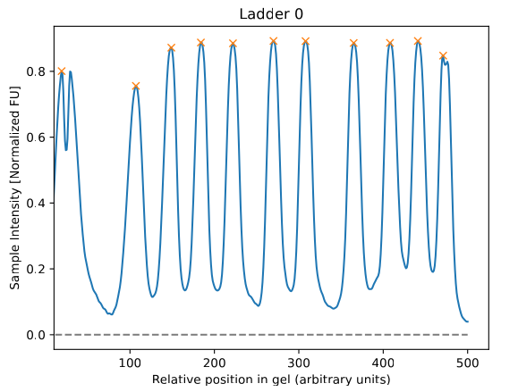
Peaks_LADDER-NAME.pdf – A line plot that will show you the detected peaks as yellow crosses. Make sure all peaks that you consider important are correctly detected. The x-axis will only give you positional values at that stage.
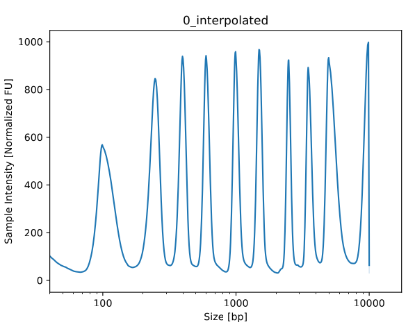
Peaks_LADDER-NAME_interpolated.pdf – Similar visualizations of ladder with base pairs already annotated.
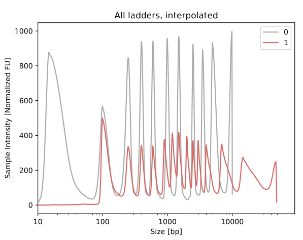
peaks_all_interpolated.pdf – Similar visualization, for multi-ladder input
Once you have checked the QC outputs and found your ladder correctly annotated, you may proceed to the plots folder and check your samples.
Plots
The directory contains results in a long table format and visualization. The visualization provides line profiles of individual samples, and additional plots if you specified categrories in the Metadata.
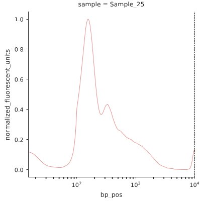
all_samples.pdf – a grid plot showing each DNA sample as an individual line plot
all_samples_summary.pdf – a line plot summarizing all samples in a single plot (average)
all_samples_by_YOURVARIABLE.pdf – a plot colored by group variable for each variable specified in the Metadata
sourcedata.csv – underlying data table, helpful for loading into another program (R, pyhton, GraphPad) or source data sharing
A single sample example is provided below:
Continue to Visualization for a detailed overview on the generated plots.
Stats
- This folder contains the statistics including group metrics in case you provided Metadata.
basic_statistics.csv
peak_statistics.csv
group_statistics.csv
Continue to Statistics for a detailed overview on the statistics.
Gel image outputs
In case you have uploaded a gel image a third folder called images will provide outputs from the image analysis. This is particularly helpful for troubleshooting. It’s recommended to carefully check these outputs to understand if all DNA lanes have been successfully recognized.
Thresholding
gel_thresholded.png is the first intermediate output showing the result of DNAvi’s thresholding. In white are all objects recognized on the image.
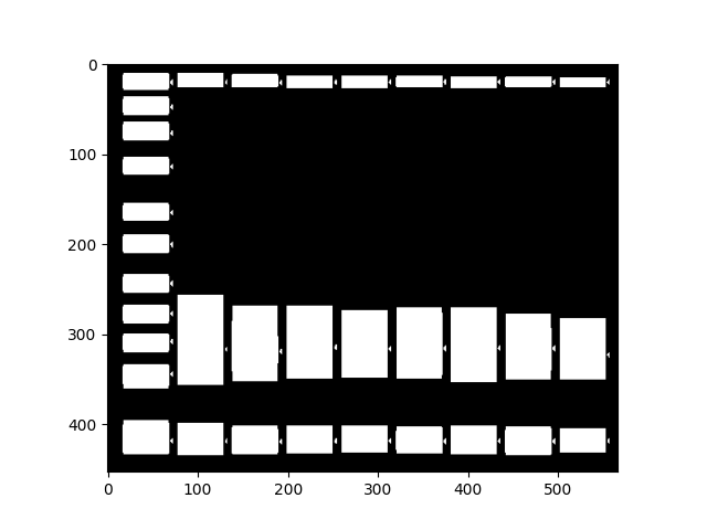
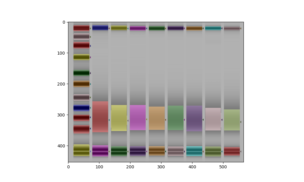
Object detection
gel_lanes.png should look like below example. Every band that is recognized will be marked by a colored overlay.
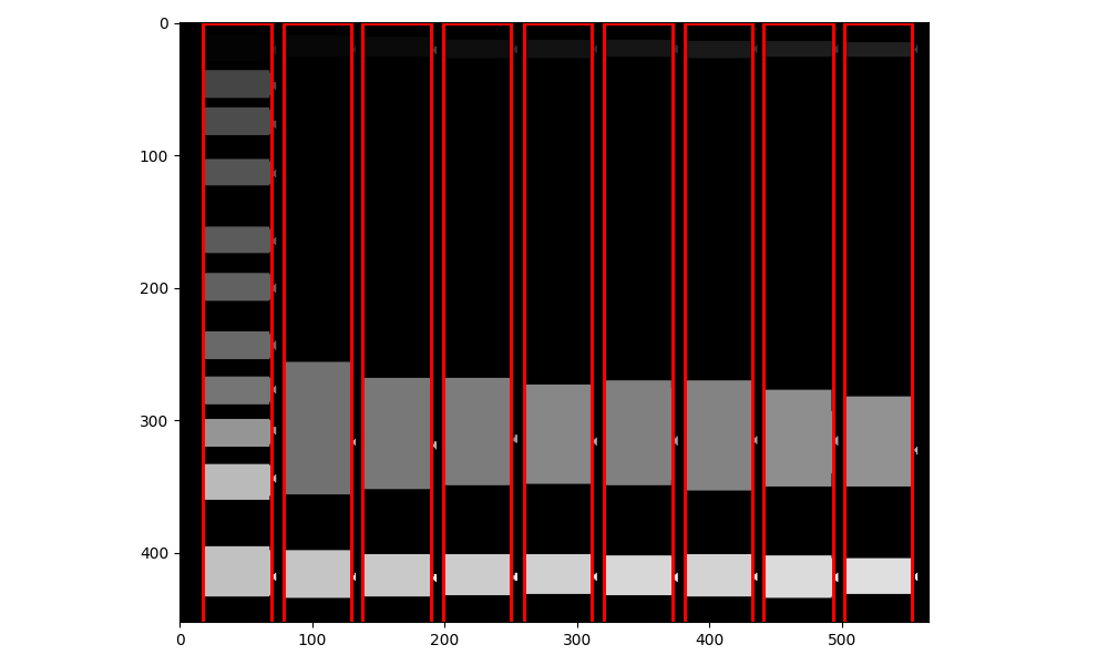
Lane border inference
gel_lanes_border.png should look like below example. Every band that is recognized will be marked by a colored overlay.
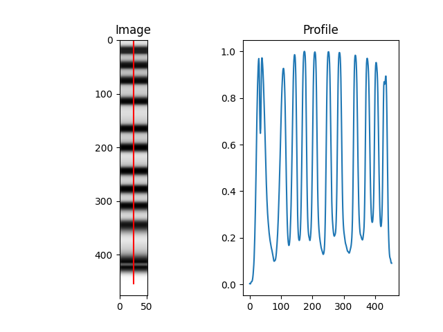
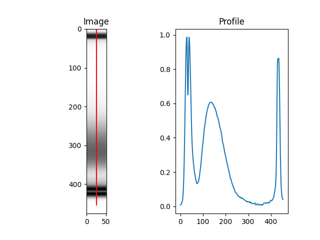
Individual DNA profiles
Each lane detected will be sliced and annotated. Below how this would look like for a ladder lane:
… or a normal sample lane:
Please carefully check our Inputs section on image inputs to assure your image is in compliance with the image quality requirements.