Visualization
Below we will discuss DNAvi’s visualization outputs and options.
Sample line plots
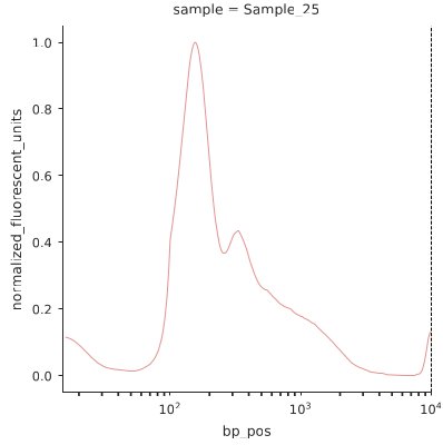
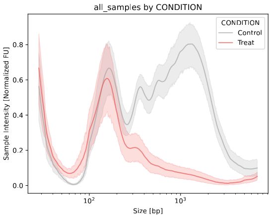
The y-axis shows normalized fluoresence signals to fit a value between 0 and 1. This way fragment profiles become comparable irrespective of sample concentration. The x-axis shows the basepair position based on the values submitted for your ladder. This is displayed in log scale. Each subplot is titled by the sample name you specified either in the table or meta file.
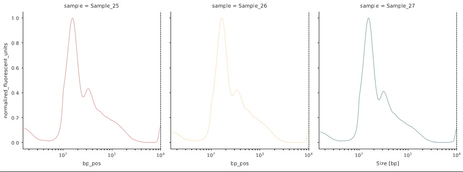
Sample grid plots
If multiple samples are present, a grid plot showing each DNA sample as an individual line plot is provided:
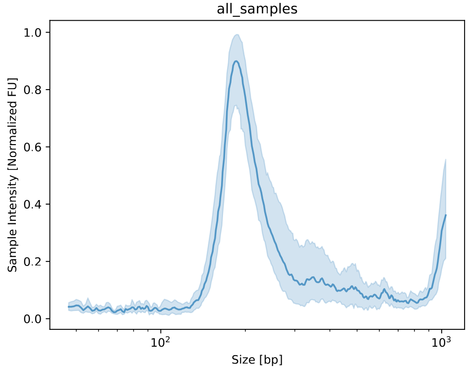
Sample average plot
If no grouping information is provided, the profiles of all samples are averaged into a single plot.
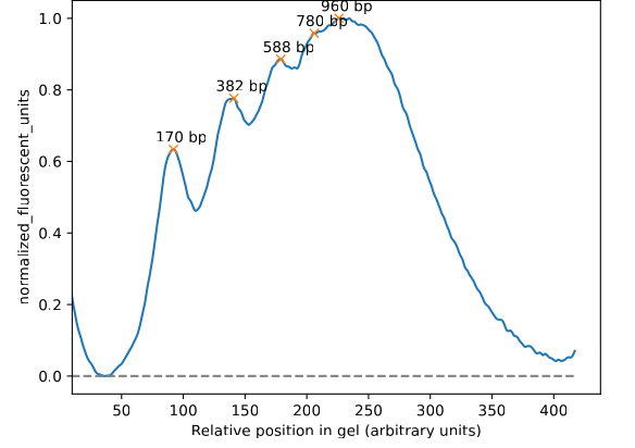
Annotated basepair peak plots
Line plots for each sample with the detected peaks and the annotated size in base pairs are in the stats folder
Grouped plots
Grouped line plot
This visualization is generated for each colummn (variable) specified in the Metadata. Each groups’ sample line profiles will be averaged and displayed in an individual color.
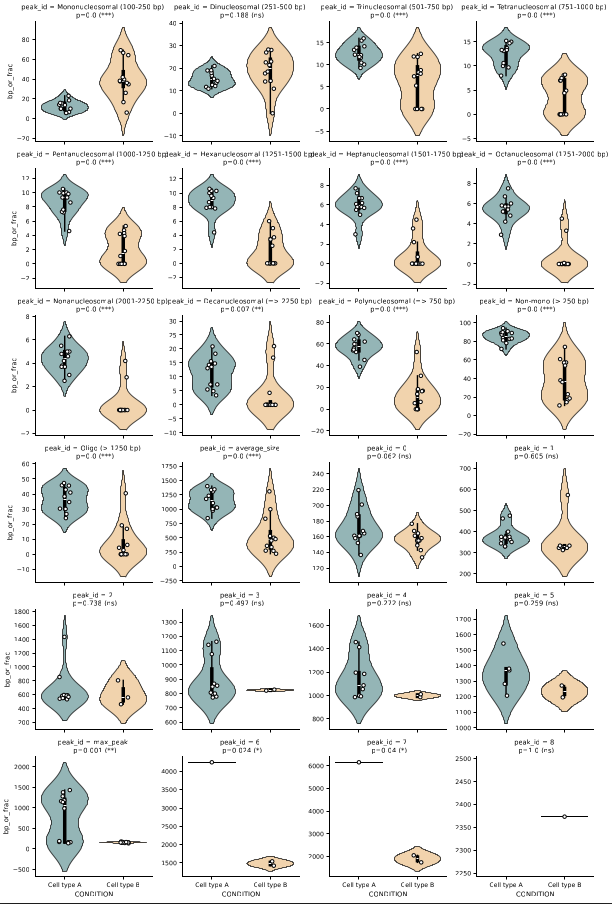
Grouped violin plot
Violin plots for average peak sizes and nucleosomal fractions including statistics (p value / significance stars) are provided as well in the stats folder
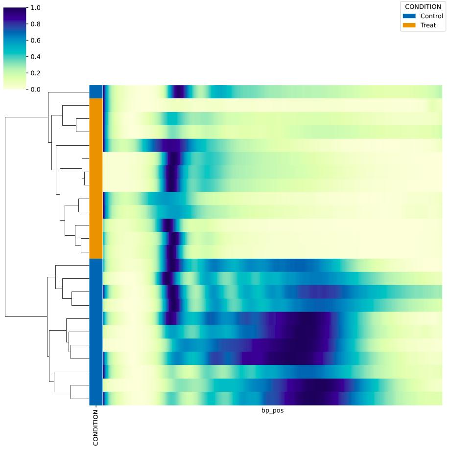
Clustermap
Clustering of samples by similarity, an additional column for each variable specified in the Metadata.